Well, i'm not too good at art, but still, i'll try to give my best advice. This is
just coming from a amateur, so don't expect much!
Well, to start with...
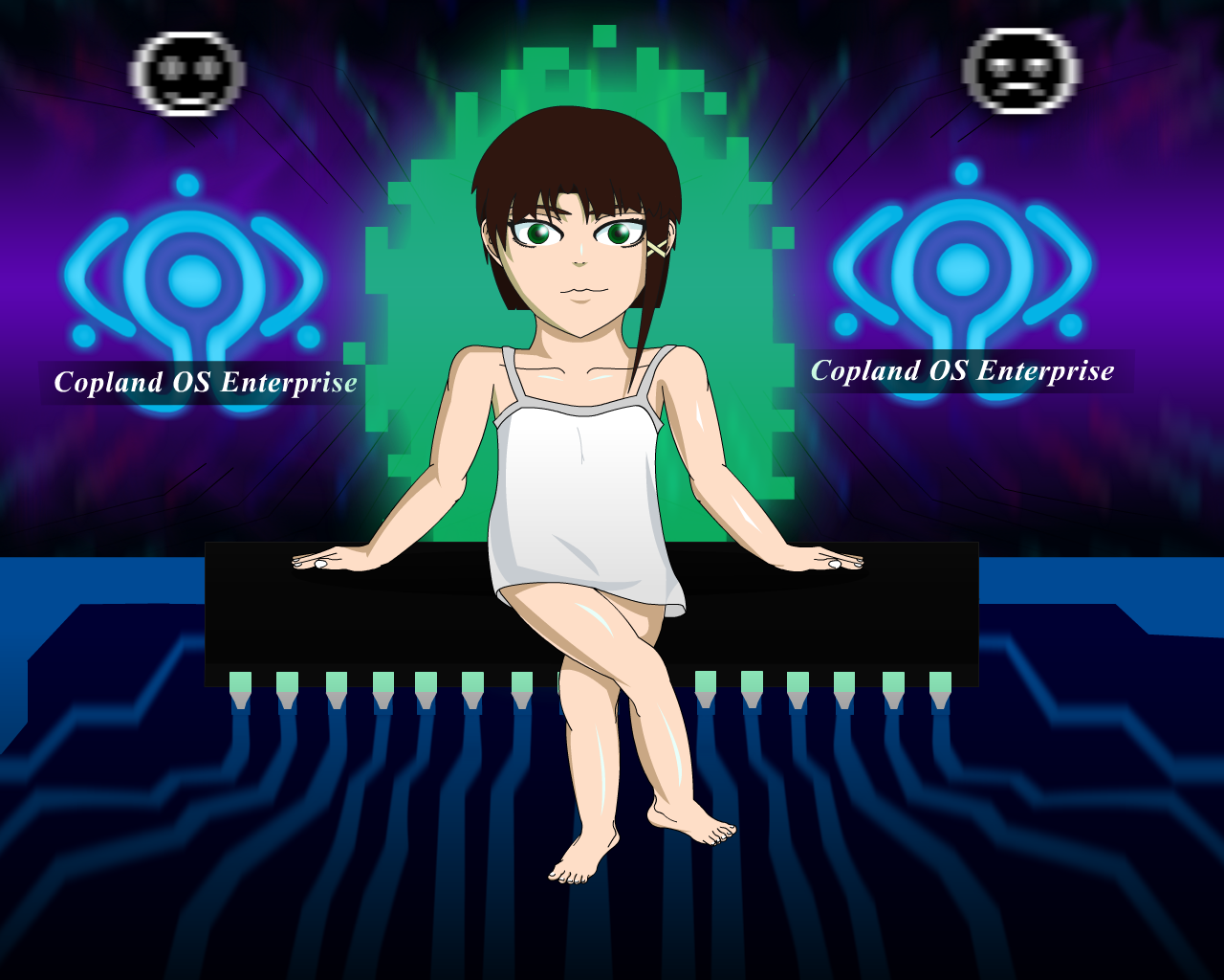
"What you have done right!"
What you have done right!
-The backgrounds themselves look pretty good in my opinion. The second background is even
better!
-You adjusted the body's size! Very well done! In the first pic, the head was just too
abnormally big, and the body was way too small.
-You added more shades! Well... just slightly... but hey, it's something.
-The eyes look more normal.
-You made the weird mouth look more normal too!
-Slightly smoother colors, and they also fit more with the background.
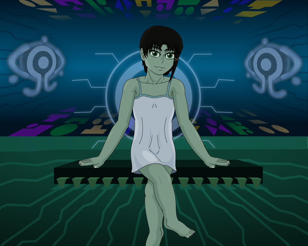
"What you did wrong."
What you did wrong.
We will only be talking about what you did wrong in the second picture.
-First, colors are still pretty boring. Well, more precisely, the shades you use. From what
i can see, all you did was use 1 color, and then splitted it in 3. One of them was just
darker, and the other one was brighter. You should try to experiment more with colors, rather
than brightness! Not sure if i am explaining this well, let me put it in another way.
Instead of adding/decreasing brigthness, try to change colors. Usually you will
want to make a color get more blue the darker it gets, and more yellow the brighter it gets, although
don't always do this, because this can prove to look horrible on certain colors. (Sorry if you
actually did this and i did not notice LOL). Example: For a red object, the darker it gets,
the more violet/purple it will become. The brighter it gets, the more pink it will become.
-Second, the shirt. Try to make the dark part just slightly darker.
-Third, the skin. She just... looks like a zombie... (Sorry for assuming it's gender)
Why is it so green? Yeah, i know you wanted to make her skin color fit with the background,
but considering that the room is all blue (except for the floor), then shouldn't her skin be blue
instead of green? Or is there some sort of green-light coming out of the ground
that's reflecting on her skin to make it look green? If so, make this noticeable by
adding bright lights on the ground.
-Fourth, i'm not really sure if it's a man or a woman... But let's say it's a woman.
In that case, you might want to make the legs a little bit thinner, and give the body
more curves. Same goes for the shape of her head, give it more curves instead of
straight lines.
-Fifth, that face... It scared me a little bit when i first saw it. Make the eyes a bit smaller
and the iris aswell. Also if you're trying to make her ( if it is a her ) look more girly,
try to make her eyes a bit more round than wide.
Extra: The sitting pose looks weird... She does not quite look like she's sitting. I don't
know how to explain it though.
Hope this had been useful even if just a little bit! I really like the backgrounds.
Also, SORRY FOR BEING SO LATE ;-;