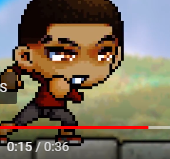
The text for the dialogue is too small. You should probably make it better so it's more comfortable to read.
Pay attention to small detail such as missing a frame in the layer such as:
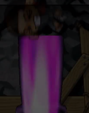
For this:

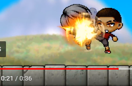
You should add a fire effect before you just have that one pop in there suddenly. You should also add some sort of flicker effect over the fire too by making it a movieclip and putting an add blend over it while having it flicker by two to four frames in the movie clip.
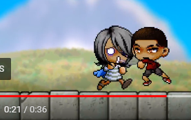
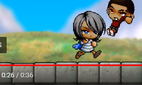
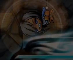
So how is Andre behind her after she just punched him and sent him flying? You probably shouldn’t have your character stay in the same pose and instead find a pose that faces the other direction where she’s facing Andre. If you're going to add a dust effect after your character punches him, you should've indicated him crashing to a wall such as adding camera shake and a sound effect.
As the dust clouds went away, you could've faded them out.

Either don't have the camera zoom all the way out so it doesn't show the effect cutting off or use a different effect.

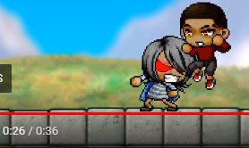
Physics. She should not be just floating in the air as if time was slowed down while Andre is flying and kicking her up in the air in normal speed which is also not good because that just isn't how physics work.

The background is moving while the ground looks like it isn't at all. You probably could've blurred it and have it move in a loop just like the background.

It would've looked better if the rocks were in front of him with a hit and dust effect added to it.
All of the build up with the skills before he just slides to the left in a very short distance was unnecessary. Also, these two effects conflict with each other so much. A fire skill with some dark dash right after doesn't fit very well. A very small and quick effect would work better OR he could've just leaped back.
I believe it would be better if he passed by the camera instead of it barely keeping up with him. It looked like he's walking too fast because the background is moving too quickly but when the camera is zoomed out, he's walking in normal speed.

The pause was dragged on for too long. You should shave some frames off.
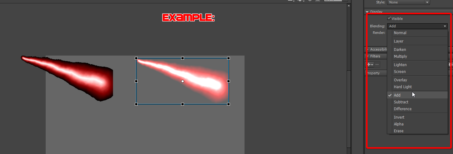
You could've set the blend mode to add, so it doesn't have the black outline.
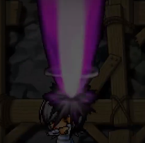
First off, again, pay attention to small details. I can see the end of that dark overlay (See the very top of this image). Second, why does he fade out and then

a... Drawn hole suddenly appear without any hit effects with the beam cutting off?
Overall
Here's something I noticed that recurs a lot in the animation, all of your tweens have NO easing in them and you have poor sound effect usage. You need to add anticipation when it comes to tweens. For example, during the motion before throwing a punch, you would ease in (-100) and after the punch, your character slides, easing out (100).